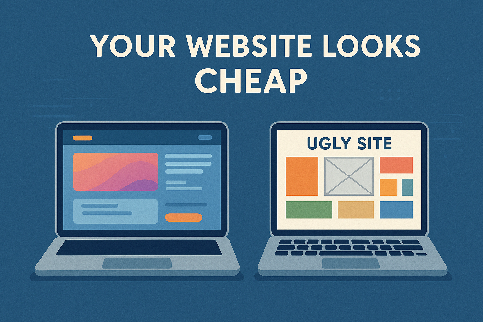
5 Design Mistakes That Make Your Website Look Cheap
Don't let your website keep looking cheap - follow these tips to show yourself professionally in the market and build trust with your audience
5 Design Mistakes That Make Your Website Look Cheap (And How to Fix Them)
Your website is often the first impression a customer has of your brand. In today’s digital-first world, that first impression happens in less than 50 milliseconds—the time it takes for visitors to form an opinion about your site. If it looks careless, unprofessional, or outdated, it doesn’t matter how good your product or service is: you’ll be losing credibility instantly.
According to Stanford Web Credibility Research, 75% of users admit to making judgments about a company’s credibility based on their website’s design. That’s a massive number—and it means your design is directly impacting your bottom line.
In this comprehensive guide, we’ll walk you through the 5 most common design mistakes that make websites look cheap, unprofessional, and outdated—and more importantly, we’ll show you exactly how to avoid them and create a website that builds trust, converts visitors, and represents your brand professionally.
1. Excessive Use of Bright or Poorly Matched Colors
The Problem with Excessive Use of Bright or Poorly Matched Colors
Improper use of color is one of the most visible mistakes that instantly signals an amateur website. Loud, neon colors, poorly contrasting combinations, or a meaningless rainbow of hues can make your site look like it was designed in the early 2000s. We’ve all seen those websites that assault your eyes with bright yellows, electric blues, and lime greens—all on the same page.
Color psychology plays a crucial role in web design. The wrong colors can:
- Make text unreadable
- Cause eye strain and make visitors leave quickly
- Confuse your brand message
- Create a sense of chaos and unprofessionalism
- Reduce conversion rates by making CTAs invisible or overwhelming
Real-World Example
Imagine landing on a financial services website with hot pink buttons, neon green headers, and orange text on a yellow background. Would you trust them with your money? Probably not. Color choices communicate professionalism—or the lack thereof.
How to Fix It
Use a coherent and limited color palette (3 to 4 main tones). Here’s how:
-
Start with your brand colors: If you have established brand colors, use those as your foundation
-
Apply the 60-30-10 rule: 60% dominant color, 30% secondary color, 10% accent color
-
Ensure proper contrast: Use tools like WebAIM’s Contrast Checker to ensure your text is readable
-
Use professional color palette generators:
- Coolors.co for instant palette generation
- Adobe Color for more advanced color theory
- Paletton for complementary color schemes
-
Test on multiple devices: Colors can look dramatically different on various screens
Pro tip: Look at websites in your industry that you respect and analyze their color choices. You’ll notice most professional sites stick to 2-3 colors maximum, with one dominant color and strategic accent colors for CTAs.
Need help selecting the perfect color palette for your brand? Our branding services specialize in creating cohesive, professional color schemes that convert.
2. Poorly Legible or Outdated Typography
The Problem
Typography is the silent communicator of your website. Cursive fonts, overly decorative typefaces, or hard-to-read fonts—especially on mobile devices—give a sense of carelessness or lack of experience.
Common typography mistakes include:
- Using Comic Sans or Papyrus (yes, people still do this)
- Having too many different fonts (more than 3)
- Using decorative fonts for body text
- Font sizes that are too small (under 16px for body text)
- Poor line height and letter spacing
- All caps for long paragraphs
- Centered text for body paragraphs
The Impact on User Experience
Poor typography doesn’t just look bad—it actively hurts your business:
- Reduced readability = visitors leave faster
- Increased bounce rates = lower SEO rankings
- Decreased comprehension = lower conversion rates
- Accessibility issues = you’re excluding potential customers
How to Fix It
Opt for modern, clean, and legible typography. Here’s your typography checklist:
-
Choose professional web fonts:
- Sans-serif fonts: Inter, Poppins, Lato, Montserrat, Open Sans (great for modern, clean looks)
- Serif fonts: Merriweather, Playfair Display, Lora (excellent for editorial content)
-
Maintain clear hierarchies:
- H1: 32-48px (only one per page)
- H2: 24-32px
- H3: 20-24px
- Body text: 16-18px minimum
- Mobile: Scale down 10-20% but never below 16px
-
Use proper spacing:
- Line height: 1.5-1.8 for body text
- Paragraph spacing: at least 1em
- Letter spacing: slight adjustments for headers (0.02-0.05em)
-
Limit font families: Use maximum 2-3 fonts—one for headers, one for body, and optionally one for accents
-
Test readability: Use the Hemingway Editor to ensure your text is easy to read
Remember: Your font choices should support your content, not compete with it. When in doubt, choose simplicity over style.
Looking to create a typography system that’s both beautiful and functional? Our web design services include comprehensive typography systems that enhance readability and reinforce your brand.
3. Poor Visual Structure and Clutter
The Problem
A website without margins, with crowded text blocks, or without white space is visually tiring and looks improvised. This is perhaps the most common mistake we see with DIY websites and cheap templates.
Cluttered websites suffer from:
- No breathing room between elements
- Text that runs edge-to-edge
- Sections crammed together
- No clear visual hierarchy
- Information overload
- Lack of focus or clear user flow
Why White Space Matters
White space (or negative space) is not wasted space—it’s a powerful design element that:
- Increases comprehension by 20% (according to Human Factors International)
- Guides the eye to important elements
- Creates sophistication and premium perception
- Improves mobile experience by giving touch targets room
- Reduces cognitive load on visitors
Think about luxury brands like Apple, Tesla, or high-end fashion websites. What do they all have in common? Generous white space.
How to Fix It
Use a clear visual grid and respect spaces. Here’s how to structure your pages properly:
-
Implement a grid system: Use 12-column grids (Bootstrap) or CSS Grid for consistent layouts
-
Add proper padding and margins:
- Section padding: 80-120px top/bottom on desktop, 40-60px on mobile
- Element margins: 20-40px between major elements
- Container max-width: 1200-1400px with auto margins
-
Create visual hierarchy:
- Most important element → largest/boldest
- Secondary elements → medium weight
- Supporting details → smallest/lightest
-
Follow the F-pattern or Z-pattern: Users scan in predictable patterns—design accordingly
-
Use visual dividers: Subtle lines, color blocks, or spacing to separate sections
-
Embrace minimalism: Remove elements that don’t serve a clear purpose
Pro tip: Try the “blur test”—blur your webpage and see if you can still identify the main sections and hierarchy. If everything blends together, you need more spacing and contrast.
Our web design services include comprehensive UX/UI design that creates clean, organized layouts that guide users naturally toward conversion.
4. Low-Quality Images or Lack of Visual Coherence
The Problem
Pixelated photos, generic stock images (especially the obviously fake ones), or images unrelated to your brand are a big “no”. They damage the perception of quality instantly and make visitors question your professionalism.
Common image mistakes include:
- Using obviously staged, cheesy stock photos (you know the ones—people in suits high-fiving in a conference room)
- Pixelated or low-resolution images
- Inconsistent image styles (mixing photography, illustrations, and clipart)
- Images with different lighting or color treatments
- Watermarked stock photos
- Using images just to fill space, not to communicate
The Visual Coherence Factor
Visual coherence means all your images work together to tell a consistent brand story. When you mix different styles, your website looks like it was assembled from random parts rather than designed as a cohesive whole.
How to Fix It
Invest in professional images or quality visual banks. Here’s your image strategy:
-
Source high-quality images:
-
Maintain consistent aesthetic:
- Choose one primary style (photography, illustration, 3D, etc.)
- Apply consistent color grading/filters
- Use similar composition styles
- Match lighting and mood across images
-
Optimize for performance:
- Use WebP format for 25-35% smaller file sizes
- Implement lazy loading
- Serve responsive images (different sizes for different devices)
- Compress without quality loss using tools like TinyPNG or ImageOptim
-
Use appropriate dimensions:
- Hero images: 1920x1080px minimum
- Product photos: 1200x1200px minimum
- Thumbnails: 400x400px
- Always 2x resolution for retina displays
-
Add meaningful alt text: Helps SEO and accessibility
Investment tip: Professional photography or custom illustrations may seem expensive upfront, but they pay for themselves in increased credibility and conversions. We’ve seen conversion rate increases of 30-40% simply from upgrading from stock photos to custom brand photography.
Need help creating a consistent visual identity for your website? Our branding team can help with everything from photography direction to custom illustrations that truly represent your brand.
5. Lack of Consistency Between Sections
The Problem
Designs that change drastically from one section to another—without justification—confuse the user and reduce trust. We’ve all experienced this: you scroll down a homepage and suddenly it feels like you’ve landed on a completely different website.
This happens when:
- Different designers work on different sections
- Templates are mixed together
- There’s no design system in place
- Changes are made over time without a cohesive plan
- Different button styles, colors, and fonts appear throughout
- Spacing and layouts are inconsistent
Why Consistency Builds Trust
Consistency in design creates predictability, and predictability creates comfort. When users know what to expect, they can focus on your message rather than figuring out how to navigate your site. Inconsistent design makes users work harder—and they’ll simply leave rather than struggle.
How to Fix It
Define a design system and stick to it religiously. Here’s what you need:
-
Create a style guide that includes:
- Color codes (hex, RGB) for all brand colors
- Typography rules (fonts, sizes, weights, spacing)
- Button styles (primary, secondary, tertiary)
- Icon style and library
- Spacing system (4px, 8px, 16px, 32px increments)
- Grid structure
- Image treatment guidelines
-
Establish component patterns:
- CTA buttons should look identical everywhere
- Form inputs should have consistent styling
- Cards and containers should follow the same design
- Navigation elements should be predictable
-
Use design tokens: Define values once, use everywhere (especially important for development)
-
Create section templates: Design reusable section layouts
-
Document everything: Your design system should be a living document
-
Audit regularly: Check for inconsistencies quarterly
Tools for creating design systems:
- Figma (our preferred tool for design systems)
- Adobe XD
- Sketch
- InVision DSM
Real-world impact: Companies with strong design systems see 40% faster design-to-development time and significantly higher user satisfaction scores.
Our web development services include comprehensive design systems for every client website—ensuring that your site not only looks professional today but remains consistent as it grows and evolves.
The Bottom Line: Design is an Investment, Not an Expense
A professional design doesn’t require huge budgets, but it does require attention to detail, strategic thinking, and expertise. Avoiding these common mistakes can make the difference between a site that builds trust and one that drives users away.
Remember: your website is your digital storefront. In many cases, it’s your only storefront. You wouldn’t open a physical store with peeling paint, broken signs, and cluttered aisles—so why accept that online?
The Real Cost of a Cheap-Looking Website
Consider these statistics:
- 88% of online consumers are less likely to return to a site after a bad experience (Source: Sweor)
- 38% of people will stop engaging with a website if the content or layout is unattractive
- 94% of first impressions are design-related
- Professional design can increase conversions by 200% or more
The question isn’t whether you can afford to invest in professional design—it’s whether you can afford not to.
Ready to Transform Your Website from Cheap to Premium?
You don’t have to settle for a website that undermines your credibility. Whether you’re starting from scratch or ready to redesign your existing site, we’re here to help.
At our agency, we specialize in creating websites that:
- Build instant credibility and trust
- Convert visitors into customers
- Position you as the leader in your industry
- Grow with your business
- Stand out from competitors
We’ve helped hundreds of businesses transform their digital presence—from small local businesses to growing mid-market companies. Our design process is collaborative, strategic, and focused on results, not just aesthetics.
What You Get When Working With Us
✅ Strategic design based on conversion research and best practices ✅ Custom visuals that represent your unique brand ✅ Mobile-first responsive design that works flawlessly on all devices ✅ Fast-loading, optimized websites that rank well in search ✅ Comprehensive design systems for long-term consistency ✅ Ongoing support to keep your site fresh and competitive
Don’t let a cheap-looking website hold your business back any longer.
👉 Schedule a free design consultation and let’s discuss how we can elevate your digital presence to match the quality of your business.
👉 View our portfolio to see examples of websites we’ve transformed from amateur to professional.
👉 Explore our web design services to learn more about our process and packages.
Your website should be your best salesperson, not your biggest liability. Let’s fix that together.
¿Te gustó este artículo?
Explorá más publicaciones en nuestro blog o compartilo con alguien.